Ovarae Mock Brand
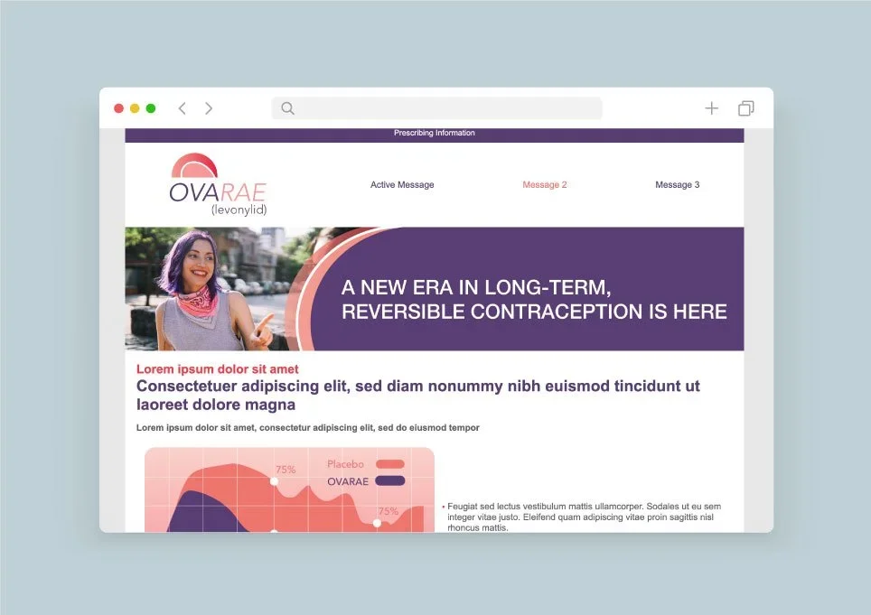
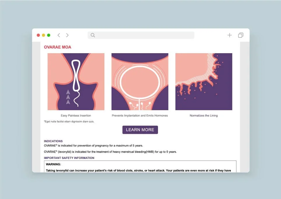
OVARAE is a mock pharmaceutical brand that I was tasked to create from the ground up: a complete identity for a fictional hormonal intrauterine ring indicated for endometriosis and hormone imbalance. I began by defining the disease state and treatment positioning, then worked with medical writers to develop the Indication and Important Safety Information so the brand would meet real-world regulatory standards.
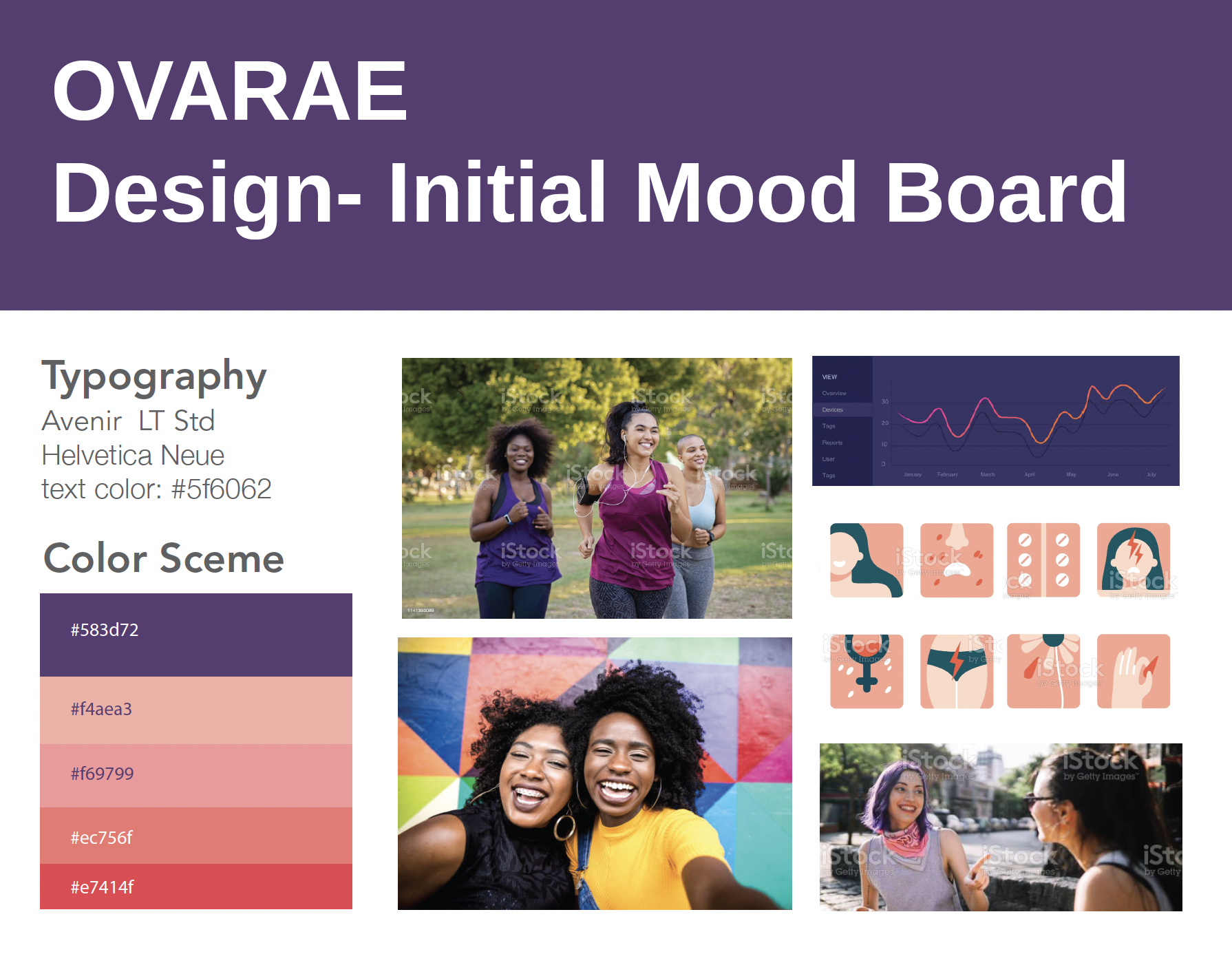
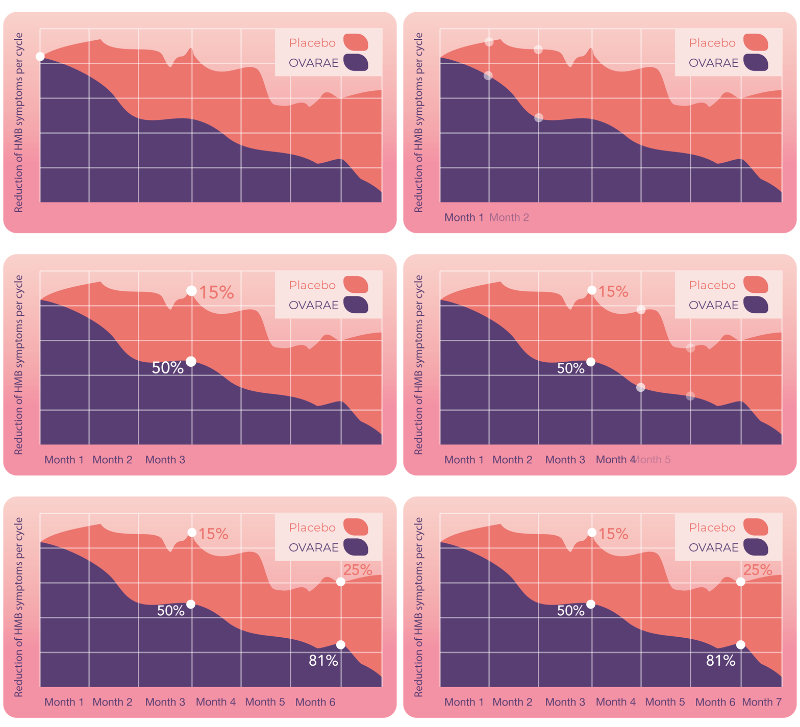
I wanted the brand to feel inclusive, especially for patients who are often underrepresented in women’s health, which shaped choices like choosing patient images. The visual work moved from sketches and mood boards through various logo directions, which I narrowed to the final gradient arc mark, and on to final imagery. Our web design team then brought it to life in mockups across digital and print.
The result is a full brand system that balances creative warmth with the compliance pharma brands require.
I explored different logo directions, each testing a different idea: concentric rings suggesting cycles and protection, a radiating burst for energy and renewal, and a rising sun with a seedling mark representing the layers of the uterus and intrauterine device.
The final mark distills that exploration into a single gradient arc, evoking a sunrise and a sense of new beginnings and the literal ring inside the womb. It keeps the warmth of the earlier sun concepts while being simpler and more recognizable at small sizes. The italic word mark splits “OVA” and “RAE” by color, which reinforces the name’s meaning and adds movement. The palette of deep plum and coral pink balances credibility with optimism.